
Refreshing a Dutch coffee icon with bold flavor and heritage
As one of the Netherlands’ most beloved coffee brands, Coffeecompany holds a special place in the hearts of coffee lovers nationwide. Rooted in authenticity and quality, it has long been a symbol of rich coffee culture and community connection. At CIRCUS, we embraced this heritage and stature by refreshing the brand identity to better reflect Coffeecompany’s flavorful character and vibrant spirit. Central to our update was the introduction of a new typeface that adds boldness and clarity to the brand’s voice, reinforcing its confident presence in a competitive market.

Iconic colors reimagined
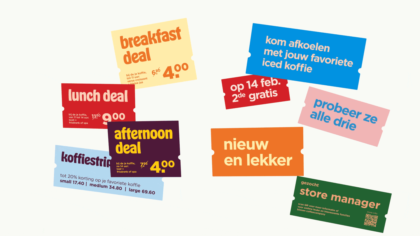
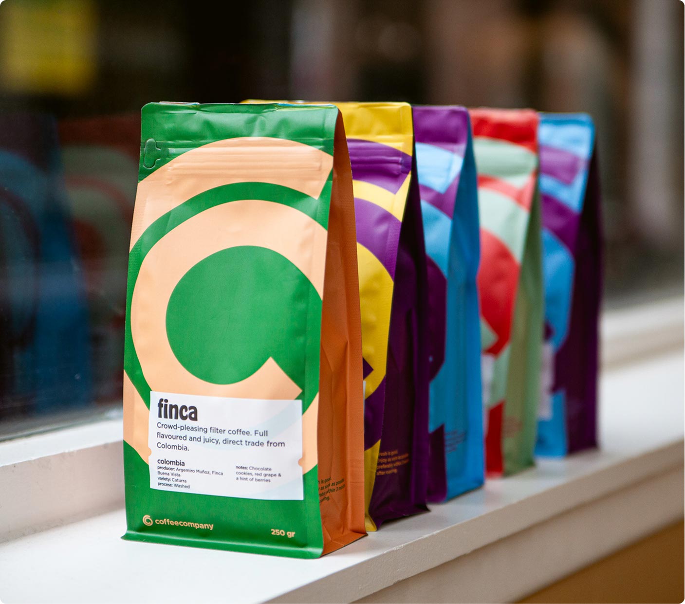
We reintroduced color inspired by Coffeecompany’s original signal brand icon—the iconic multi-colored menu—that breathes new energy and liveliness into the visual identity. This palette brings warmth and dynamism to packaging, in-store communication, and signage, creating an inviting and joyful brand experience.


Celebrating coffee culture
From redesigned packaging to vibrant in-store graphics and clear signing, every element was crafted to engage customers and enhance brand recognition. To celebrate Coffeecompany’s culture and inspire brand fans, we also designed a zine that tells its story and fuels its community.


Revitalized interior experience
The store interiors, developed by design partner Ninetynine, stand strong as engaging and welcoming spaces. Our refreshed brand identity complements their interior design seamlessly, together creating a complete and vibrant Coffeecompany experience.


Fancy a chat over some coffee?
Want to learn more about how we bring brands to life? Get in touch with us at CIRCUS and let’s explore how we can help your brand’s next chapter take shape.
Let's talk: mark@welcometocircus.com
Work
Collaborators
Ninetynine - Interior

